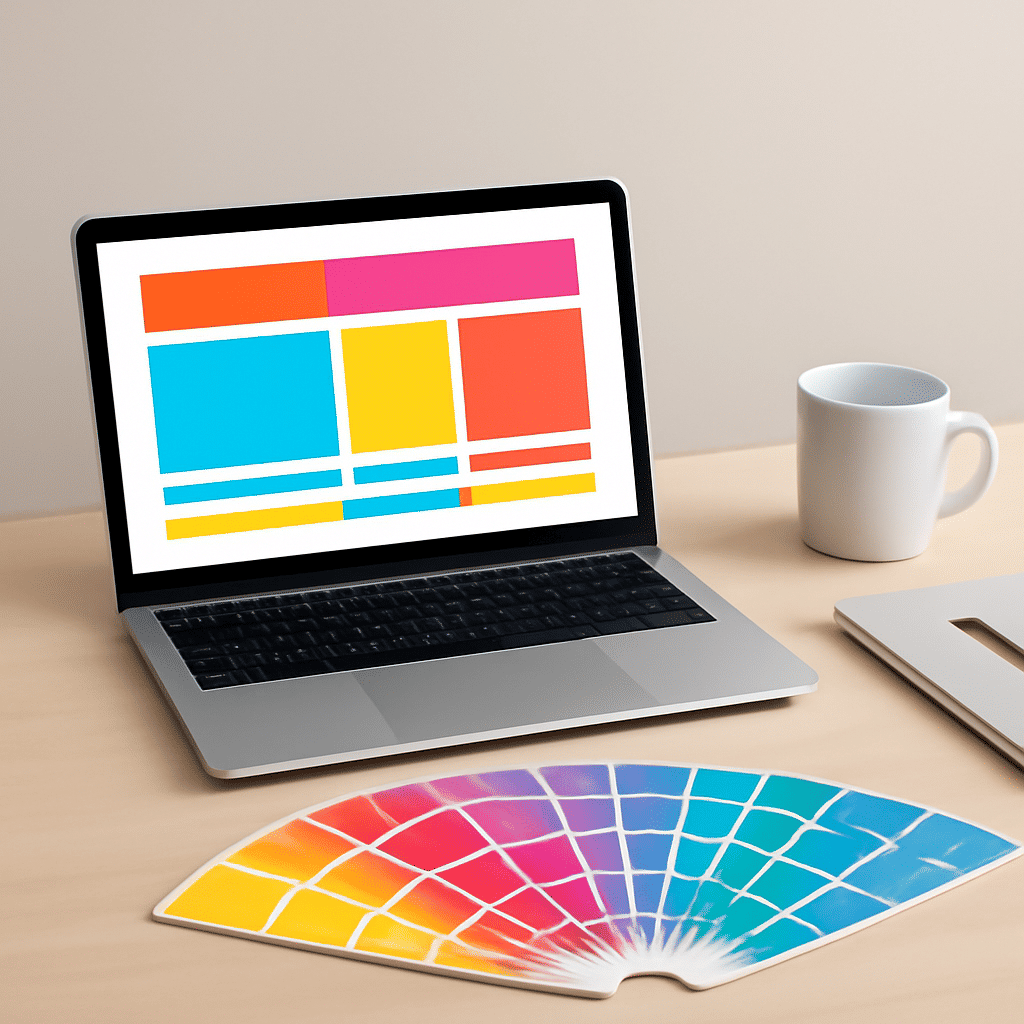
Color choices on the web are paramount for crafting an engaging user experience. They have the power to influence emotions, behavior, and even the decisions users make while navigating a site. Understanding color theory can help create visually harmonious schemes that resonate well with visitors.
The Psychology of Color
Colors evoke emotions, playing a pivotal role in user interaction. For instance, blue is often associated with trust and serenity, making it an excellent choice for platforms that want to convey reliability. Conversely, red can evoke excitement or urgency, which may spur users into action.
Neutral tones like white, grey, and black often serve as backgrounds for more vibrant colors, maintaining balance and emphasizing content. It's important to understand cultural differences as well—certain colors may have distinct meanings in different regions, influencing a global audience diversely.
Creating Harmonious Color Schemes
A harmonious color scheme ensures that colors complement rather than clash, enhancing aesthetic appeal and readability. Here are some popular approaches to creating such schemes:
-
Analogous Scheme: This involves using colors that are next to each other on the color wheel, often found in nature. This scheme is pleasing to the eye and creates a serene and comfortable design.
-
Complementary Scheme: By pairing colors that are opposite each other on the color wheel, this approach introduces high contrast that can make elements stand out, great for call-to-action sections.
-
Monochromatic Scheme: Utilizing variations in lightness and saturation of a single hue, it offers a clean and elegant look, making it easier to highlight specific components through the use of textures and shades.
-
Triadic Scheme: Using three colors that are evenly spaced around the color wheel, this approach provides a vibrant yet balanced palette, ensuring a lively and harmonious look without sacrificing contrast.
Tips for Effective Color Use
-
Accessibility First: Ensure that your color scheme remains clear and accessible to all users, including those with color vision deficiencies. This involves checking contrast ratios and avoiding color combinations that might be difficult to distinguish.
-
Brand Consistency: Align your color choices with the brand’s identity, creating a cohesive experience that reinforces brand recognition across all platforms.
-
Testing is Key: Always test color choices with real users. Collect feedback and observe how different schemes impact user behavior and engagement.
-
Stay Updated: Color trends can shift. Being aware of current trends in digital design can help keep your interface looking fresh and contemporary.
In conclusion, mastering color theory enhances the power of web design. By thoughtfully selecting and combining colors, designers can create interfaces that are not only visually pleasing but also engender positive emotional responses, guiding users toward fulfilling their intentions on the site.